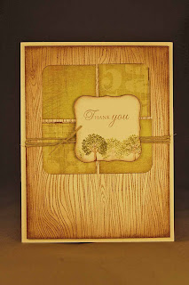
I adore this layout. It wasn't what I was planning to do when I started the card but, rather, came from necessity. You see, I added the hemp to the card front and tied it before checking to see if the knot was going to be where I wanted it. When I went to place the die cut shape in the middle of the 4 green squares, the knot was too far toward the middle! I initially said some bad words and went to untie the knot but then placed the die cut where it is now and loved it!!!
The little tree at the bottom of the focal image piece is from Through the Trees (Papertrey Ink). It is a mini version of the larger tree image in the set. I hadn't even realized it was there. I stamped it and then did some stamping off to get the varied intensities of ink colors. The backgound is the wonderful Woodgrain stamp by Hero Arts. I am so glad I bought that stamp!!! Totally worth every penny I paid for it!!
Well, another masculine card to add to my stash. How are you doing with your masculine cards??? The more I make them the easier I find them to make.
Thanks for dropping in!
Donelda

3 comments:
I love that you're posting masculine ideas. I always need more! Thanks!!!
The off-centre placement of the die cut adds so much more interest to the card... accident or not!
(Masculine cards? What masculine cards? :P)
I have very few masculine cards made, but I am certainly inspired by your fabulous card today. Once again you have great colours and textures.
Post a Comment